Estimated reading time: 9 minutes
Picking a color palette for your home sounds fun—until you’re staring at a wall of paint swatches, wondering why there are 147 shades of white. (Seriously, who needs that many?) But don’t worry, I’ve been there, and I’m here to guide you through the process in a way that makes sense—without the stress-induced headaches.
Whether you want a calming oasis, a lively social space, or just a room that doesn’t make you cringe every time you walk in, I’ll help you get there.
Here’s what you’ll learn today:
✔ How colors affect mood (yes, your walls might be the reason you’re always sleepy)
✔ Why neutrals are the best foundation (no, that neon green wall isn’t the move)
✔ How lighting changes everything (spoiler: store lighting is lying to you)
✔ A foolproof formula to make any space look cohesive (because random color chaos isn’t chic)
Let’s dive in!
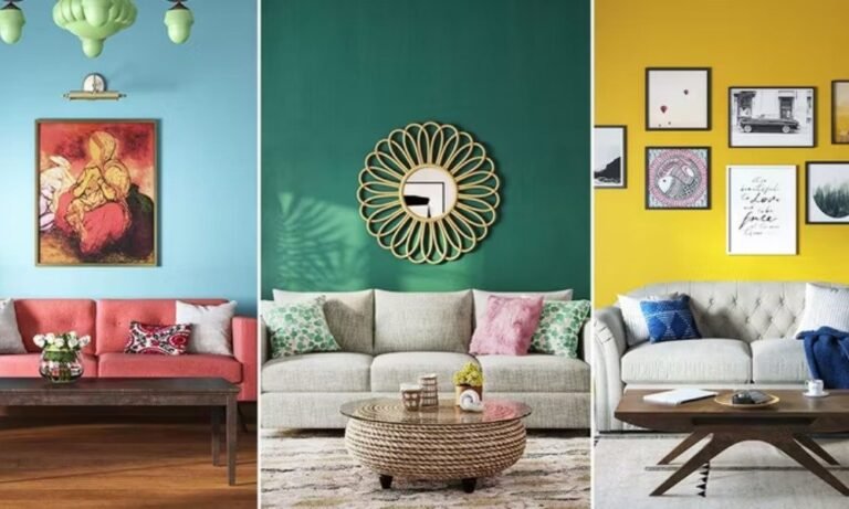
Color Psychology: Why Your Walls Might Be Messing with Your Mood
Believe it or not, colors can make or break the vibe of a space. I’ve seen it firsthand—choose the wrong color, and suddenly your “relaxing” bedroom feels like a high-energy nightclub. (Unless that’s your thing—then, by all means, go for it.)
Here’s a quick breakdown of what different colors do to your brain:
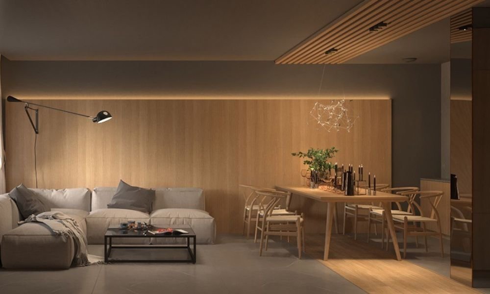
- Blues & Greens → Calm, peaceful, and put-together (great for bedrooms and offices)
- Reds & Yellows → Energetic, lively, and a bit bold (best for dining rooms or social spaces)
- Neutrals (Grays, Beiges, Whites) → Timeless, flexible, and easy on the eyes (safe for literally anywhere)
If you’re not sure what feeling you want in a room, start with this guide on color psychology in interior design (read more). Trust me, your future self will thank you.
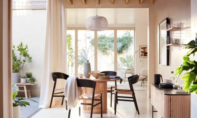
Start with a Neutral Base (No, Neon Green Walls Aren’t a Good Idea—Usually)
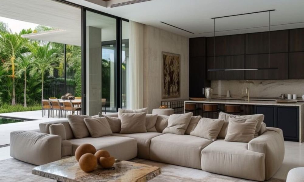
Neutrals are your best friend in home design. They give you a solid foundation, letting you bring in color through furniture, decor, and accents. Think of it like fashion: a classic black outfit works, and you can swap out accessories to change the look.
Some go-to neutrals:
✔ Warm Whites – Cozy, soft, and inviting
✔ Cool Grays – Modern, sleek, and sophisticated
✔ Greige (Gray + Beige) – The ultimate in versatility
Worried about a space looking too plain? This is where small decor swaps come in. A bright pillow, bold rug, or colorful artwork can transform a neutral room instantly. Check out these budget-friendly interior design tips (read more) for more ideas!
Lighting: The Sneaky Factor That Changes Everything
Ever bought a paint color you LOVED at the store, only to bring it home and wonder why it suddenly looks… off? That’s because lighting lies.
Your color can look completely different depending on:
✔ Time of Day – Natural light shifts as the sun moves
✔ Artificial Lighting – Warm vs. cool bulbs change color perception
✔ Surroundings – Reflections from furniture, flooring, and decor affect the final look
Pro Tip: Never pick a paint color at night under artificial lighting. You WILL regret it. Instead, test swatches on your walls and check them throughout the day. Want to make your lighting work FOR you? Learn how to enhance your home’s ambiance with lighting (read more).
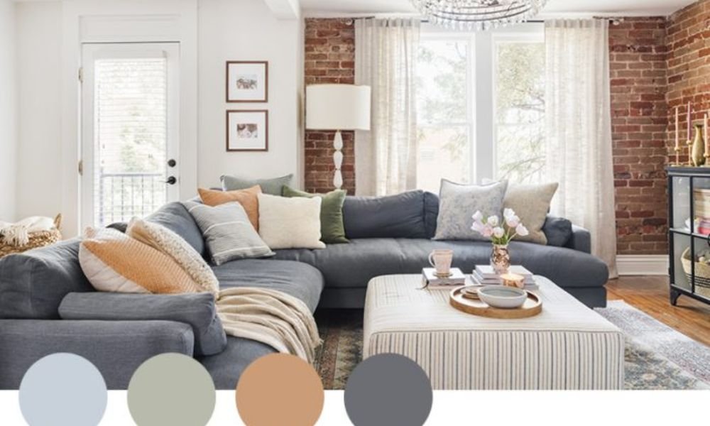
The 60-30-10 Rule: Your Color Palette Cheat Code
This is one of my go-to designer tricks. The 60-30-10 rule keeps your color palette balanced, effortless, and (most importantly) visually pleasing.
- 60% Main Color → Walls, large furniture (sofas, rugs)
- 30% Secondary Color → Curtains, chairs, bedding
- 10% Accent Color → Pillows, artwork, small decor
Let’s say you love blue:
- 60% soft navy walls
- 30% crisp white furniture
- 10% gold accent pieces
Boom—instant designer-level coordination!
If you’re working with a small space, applying this method strategically can make a room feel bigger. Check out these small space design rules (read more) to maximize impact.
Trendy vs. Timeless: Striking the Right Balance
I get it—trend colors are tempting. Who wouldn’t want a stylish, Instagram-worthy space? But trends come and go, and repainting every year isn’t exactly fun.
How to use trends wisely:
✔ Stick to timeless neutrals for walls
✔ Bring in trendy colors through decor (pillows, art, vases)
✔ Mix classic and modern elements for longevity
Curious about what’s hot right now? Check out the latest home décor trends (read more).
Testing Colors: Don’t Skip This Step!
Before committing to a color, ALWAYS test it in different areas of the room. Here’s how:
✔ Paint a small sample on each wall (at least a 12×12-inch section)
✔ View it morning, noon, and night under different lighting
✔ Compare it with your furniture and decor to ensure it complements the space
Bonus tip: If you’re unsure, many brands now offer peel-and-stick paint samples—no messy commitment needed!
Final Thoughts: Picking Colors Doesn’t Have to Be a Nightmare
Finding the perfect color palette isn’t about rigid rules—it’s about creating a space that feels right for YOU. Keep it simple, test your choices, and remember: paint isn’t permanent. The worst-case scenario? You repaint.
Ready to Design a Home You Love?
If you need expert guidance, I’d love to help. Whether it’s a full room transformation or just picking the perfect shade, let’s make your vision a reality. Reach out today—your dream space is just a color away!
Picking a color palette for your home sounds fun—until you’re staring at a wall of paint swatches, wondering why there are 147 shades of white. (Seriously, who needs that many?) But don’t worry, I’ve been there, and I’m here to guide you through the process in a way that makes sense—without the stress-induced headaches.
Whether you want a calming oasis, a lively social space, or just a room that doesn’t make you cringe every time you walk in, I’ll help you get there.
Here’s what you’ll learn today:
✔ How colors affect mood (yes, your walls might be the reason you’re always sleepy)
✔ Why neutrals are the best foundation (no, that neon green wall isn’t the move)
✔ How lighting changes everything (spoiler: store lighting is lying to you)
✔ A foolproof formula to make any space look cohesive (because random color chaos isn’t chic)
Let’s dive in!
Color Psychology: Why Your Walls Might Be Messing with Your Mood
Believe it or not, colors can make or break the vibe of a space. I’ve seen it firsthand—choose the wrong color, and suddenly your “relaxing” bedroom feels like a high-energy nightclub. (Unless that’s your thing—then, by all means, go for it.)
Here’s a quick breakdown of what different colors do to your brain:
- Blues & Greens → Calm, peaceful, and put-together (great for bedrooms and offices)
- Reds & Yellows → Energetic, lively, and a bit bold (best for dining rooms or social spaces)
- Neutrals (Grays, Beiges, Whites) → Timeless, flexible, and easy on the eyes (safe for literally anywhere)
If you’re not sure what feeling you want in a room, start with this guide on color psychology in interior design (read more). Trust me, your future self will thank you.
Start with a Neutral Base (No, Neon Green Walls Aren’t a Good Idea—Usually)
Neutrals are your best friend in home design. They give you a solid foundation, letting you bring in color through furniture, decor, and accents. Think of it like fashion: a classic black outfit works, and you can swap out accessories to change the look.
Some go-to neutrals:
✔ Warm Whites – Cozy, soft, and inviting
✔ Cool Grays – Modern, sleek, and sophisticated
✔ Greige (Gray + Beige) – The ultimate in versatility
Worried about a space looking too plain? This is where small decor swaps come in. A bright pillow, bold rug, or colorful artwork can transform a neutral room instantly. Check out these budget-friendly interior design tips (read more) for more ideas!
Lighting: The Sneaky Factor That Changes Everything
Ever bought a paint color you LOVED at the store, only to bring it home and wonder why it suddenly looks… off? That’s because lighting lies.
Your color can look completely different depending on:
✔ Time of Day – Natural light shifts as the sun moves
✔ Artificial Lighting – Warm vs. cool bulbs change color perception
✔ Surroundings – Reflections from furniture, flooring, and decor affect the final look
Pro Tip: Never pick a paint color at night under artificial lighting. You WILL regret it. Instead, test swatches on your walls and check them throughout the day. Want to make your lighting work FOR you? Learn how to enhance your home’s ambiance with lighting (read more).
The 60-30-10 Rule: Your Color Palette Cheat Code
This is one of my go-to designer tricks. The 60-30-10 rule keeps your color palette balanced, effortless, and (most importantly) visually pleasing.
- 60% Main Color → Walls, large furniture (sofas, rugs)
- 30% Secondary Color → Curtains, chairs, bedding
- 10% Accent Color → Pillows, artwork, small decor
Let’s say you love blue:
- 60% soft navy walls
- 30% crisp white furniture
- 10% gold accent pieces
Boom—instant designer-level coordination!
If you’re working with a small space, applying this method strategically can make a room feel bigger. Check out these small space design rules (read more) to maximize impact.
Trendy vs. Timeless: Striking the Right Balance
I get it—trend colors are tempting. Who wouldn’t want a stylish, Instagram-worthy space? But trends come and go, and repainting every year isn’t exactly fun.
How to use trends wisely:
✔ Stick to timeless neutrals for walls
✔ Bring in trendy colors through decor (pillows, art, vases)
✔ Mix classic and modern elements for longevity
Curious about what’s hot right now? Check out the latest home décor trends (read more).
Testing Colors: Don’t Skip This Step!
Before committing to a color, ALWAYS test it in different areas of the room. Here’s how:
✔ Paint a small sample on each wall (at least a 12×12-inch section)
✔ View it morning, noon, and night under different lighting
✔ Compare it with your furniture and decor to ensure it complements the space
Bonus tip: If you’re unsure, many brands now offer peel-and-stick paint samples—no messy commitment needed!
Final Thoughts: Picking Colors Doesn’t Have to Be a Nightmare
Finding the perfect color palette isn’t about rigid rules—it’s about creating a space that feels right for YOU. Keep it simple, test your choices, and remember: paint isn’t permanent. The worst-case scenario? You repaint.
Ready to Design a Home You Love?
If you need expert guidance, I’d love to help. Whether it’s a full room transformation or just picking the perfect shade, let’s make your vision a reality. Reach out today—your dream space is just a color away!