Estimated reading time: 5 minutes
Color is more than just a visual element—it’s a powerful tool that shapes our emotions and interactions within a room. Whether I’m designing a cozy retreat, an energizing workspace, or a stylish gathering area, I always ask: What kind of atmosphere do you want to create?
Understanding how different shades influence emotions helps me craft interiors that don’t just look appealing but also support relaxation, productivity, and overall well-being. The right palette can make a space calming, inviting, or even dynamic.
What You’ll Learn
- How different hues influence emotions and energy
- The best shades for various rooms
- Smart ways to blend tones for harmony
- Why psychology plays a role in design
- Practical tips for testing and selecting a palette
Now, let’s explore how to use color psychology to transform your home.
How Different Tones Affect Mood
Every shade carries emotional weight. Some create a sense of peace, while others boost energy or even stimulate appetite (which is why so many restaurants favor red!). Let’s break it down:
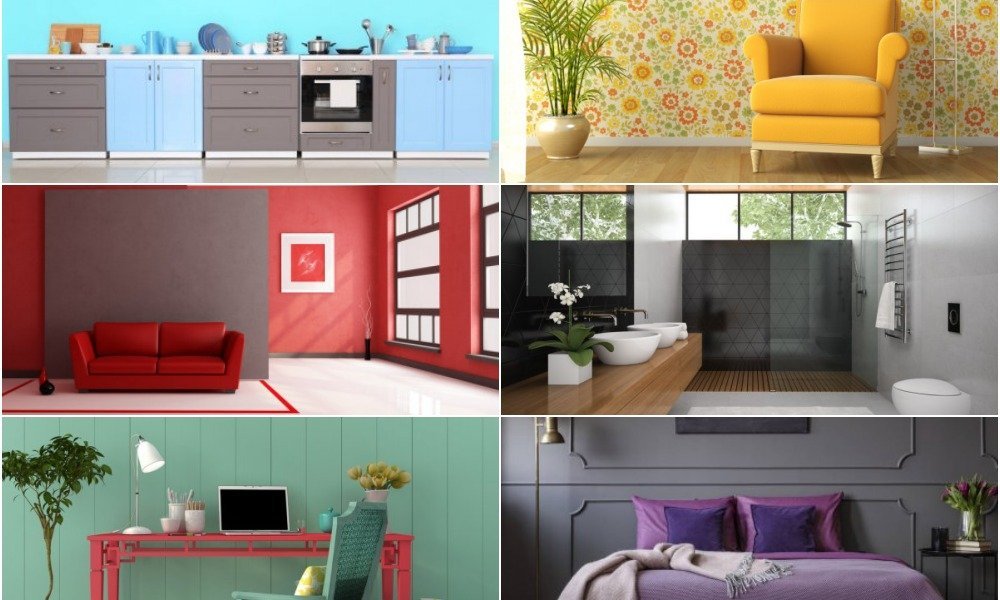
1. Blues – Relaxation, Focus, Stability
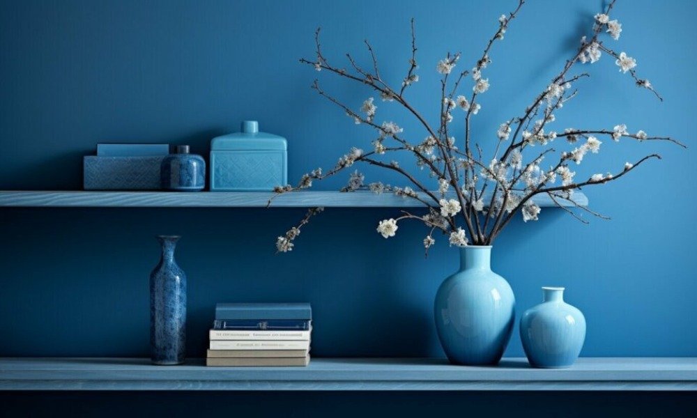
I often use blue in bedrooms and home offices. It has a soothing effect, perfect for winding down or concentrating. However, deeper tones can sometimes feel too cool, so I balance them with warm textures like soft rugs or wooden accents.
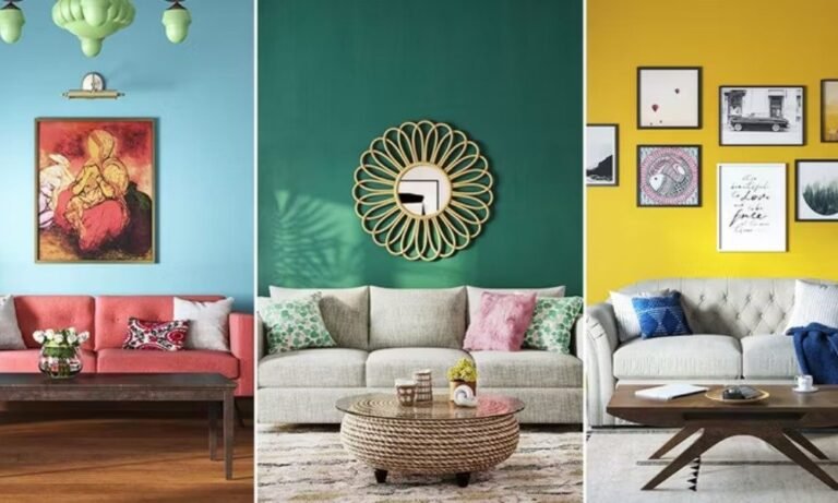
2. Reds – Energy, Passion, Conversation Starter
Red brings warmth and excitement to a room, making it ideal for dining areas or social spaces. It can also evoke appetite—hence its popularity in restaurant interiors. But too much intensity can be overwhelming, so I prefer it in small doses, like accent walls or statement furniture.
3. Greens – Nature, Freshness, Harmony
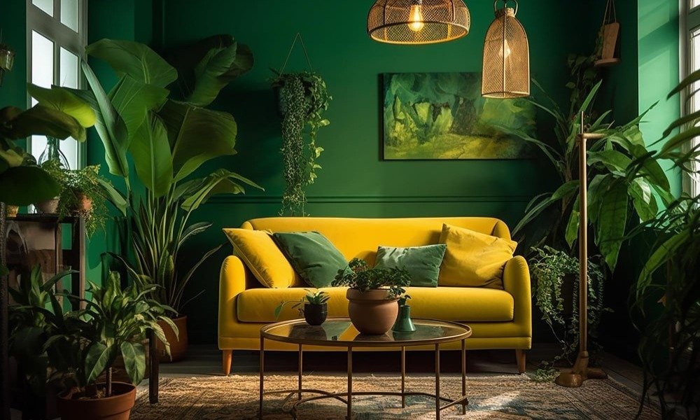
A fantastic choice for spaces meant for relaxation. Lighter versions feel airy and refreshing, while richer shades add depth and sophistication. Since green is tied to nature, it often creates a sense of balance and tranquility.
4. Yellows – Cheerful, Energizing, Warm
A splash of yellow instantly brightens a space. It’s great for kitchens or breakfast nooks, where a little extra energy in the morning can be helpful. However, intense versions can be a bit much, so I lean toward softer shades like honey or buttercream.
5. Purples – Luxury, Creativity, Depth
A color associated with elegance and artistic expression. I love using lavender in bedrooms for its calming effect, while deeper tones like plum bring richness to living rooms or study areas.
6. Neutral Shades – Versatile, Sophisticated, Timeless
Beige, gray, and taupe create a solid foundation for almost any design. They work well as backdrops and allow decor elements to take center stage. However, too much neutrality can feel uninspired, so I incorporate textured fabrics and statement pieces to keep things lively.
Picking the Right Palette for Every Room
Each area in a home has a unique purpose, so selecting shades that enhance its function is key.
Living Room: Warm & Welcoming
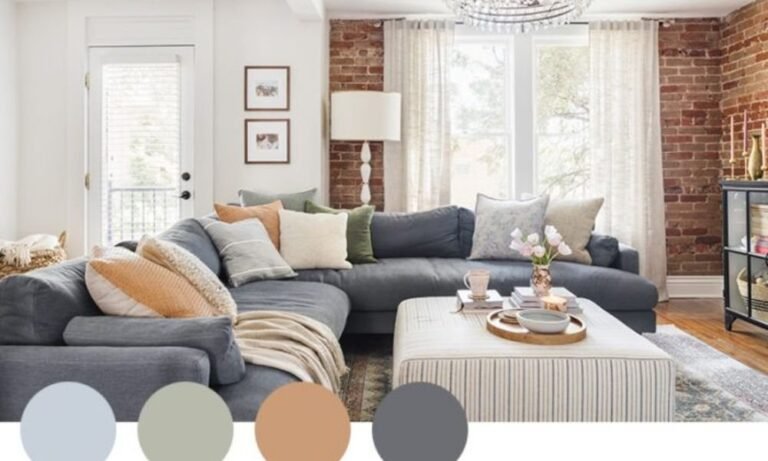
Since this is a place for socializing, I gravitate toward soft neutrals, earthy tones, or muted blues and greens. If a pop of vibrancy is desired, I introduce color through throw pillows, artwork, or an accent wall.
Looking for more ways to create a stylish yet budget-friendly home? Check out these design tips.
Bedroom: Calm & Restorative
Since sleep and relaxation are priorities here, cooler hues work best. Soft blues, greens, and lavender shades promote a restful atmosphere, while warmer tones like blush or terracotta add coziness.
Kitchen: Inviting & Lively
I love incorporating warm yellows, soft greens, or deep navy tones in kitchens. These choices keep the space feeling lively yet refined. White is always a classic, but pairing it with a contrasting shade—whether in cabinets, a backsplash, or decor—adds depth.
Need help refining your palette? Here’s my guide on choosing colors that work together.
Home Office: Focus & Productivity
For workspaces, muted greens, soft blues, and earthy neutrals keep the mind sharp and reduce stress. A darker accent wall behind a desk can enhance depth and structure without being distracting.
Blending Hues Like a Designer
1. Follow the 60-30-10 Rule
- 60% – Main Color: Walls or large furniture pieces
- 30% – Secondary Shade: Curtains, rugs, or bedding
- 10% – Accent Hue: Artwork, pillows, or decorative pieces
This formula keeps the scheme balanced and intentional.
2. Pair Colors Thoughtfully
- Monochromatic: Different shades of the same hue (e.g., light blue, navy, and teal)
- Analogous: Neighboring hues on the wheel (e.g., green, yellow, and orange)
- Complementary: Opposites that create contrast (e.g., blue and orange, red and green)
3. Consider Lighting’s Influence
Lighting can drastically change how a shade appears. A soft gray may look cozy in natural daylight but appear dull under artificial lighting. Always test swatches at different times of the day before committing.
The right lighting transforms a space—see my guide on using light for ambiance.
Common Mistakes to Avoid
Even with the best intentions, color selection can go wrong. Here are some pitfalls I help clients steer clear of:
Overdoing a Single Hue: A completely monochrome space can feel flat. Layers of texture and variation help prevent this.
Ignoring Undertones: Not all whites or grays are the same. Some lean warm, while others have cool undertones. Always compare them against flooring and furniture.
Too Much Dark in Small Spaces: While deep hues can be dramatic, too much can make a room feel smaller than it is. I balance them with lighter elements to maintain openness.
Working with limited square footage? These small space design tips might help.
Final Thoughts: Create a Space That Feels Right for You
Color psychology isn’t just about aesthetics—it’s about crafting a home that supports your well-being and daily activities. Whether you want a calming retreat, an energizing workspace, or a cozy gathering area, the right palette makes all the difference.
So, what tones resonate with you? Let me know in the comments! If you’re ready to refresh your interiors, let’s bring your vision to life.