Estimated reading time: 14 minutes
Last updated on June 9th, 2026 at 01:54 pm
There’s a specific feeling when you walk into a bathroom that’s been properly designed for calm. Nothing competing for your attention. No harsh overhead glare. Just warmth, quiet surfaces, and the immediate sense that the room was built for slowing down. You feel it before you’ve consciously registered any individual detail.
That feeling is the actual goal. Not a particular tile brand or a freestanding bath. Not candles arranged on a tray. Those things can contribute — but they’re not the cause. The cause is a set of decisions, made together, that engage your senses in a specific way. Spa style bathroom decor works when those decisions are right. It falls flat when they’re not, no matter how much money went in.
This is a guide to the decisions that matter — and the ones that don’t — grounded in what actually creates that calm rather than what photographs well.
- What a Spa Bathroom Actually Feels Like (Before We Talk About What It Looks Like)
- Lighting First — Always
- The layered system that actually works
- IP ratings, simply explained
- The Case for Fewer, Better Materials
- Natural stone: beautiful, but understand what you're committing to
- Wood in wet environments
- Bronze and brass hardware — and why they read warmer than chrome
- Wet Rooms and Freestanding Baths: When They're Actually Worth It
- Colour and the Logic Behind Calm
- Neutrals that feel warm, not cold
- Muted blues and greens: the spa colour logic
- When to use a bold accent
- Visual Quiet: What Concealed Storage Actually Does
- The Finishing Layer: Texture, Linens, and Greenery
- Spa Bathroom Ideas for Smaller Spaces
- What to Do If You're Not Ready for a Full Renovation
- FAQs
What a Spa Bathroom Actually Feels Like (Before We Talk About What It Looks Like)
Most bathroom inspiration content starts with visual mood boards. That’s exactly backwards.
A spa bathroom works because it engages multiple senses simultaneously. The temperature of the floor underfoot. The softness of a weighted towel. The quality of the light at 7am versus 9pm. The absence of clutter in your sightline. The muffled, slightly absorbed quality of sound in a room with soft surfaces. These are sensory experiences, not aesthetic ones.
The visual design follows from this. When designers talk about using warm stone, limiting the material palette, or hiding storage out of sightline — they’re solving sensory problems, not just making something look nice. Understanding that is what separates a renovation that photographs well from one that actually makes you feel better every day.
So before you choose a tile or paint colour: what does your bathroom currently feel like? Cold? Harsh? Visually busy? Functional but joyless? That diagnosis should drive every decision that follows.
Lighting First — Always
If there’s one non-negotiable in spa bathroom design, it’s lighting. And not in the vague “good lighting is important” way that fills half the internet. In a specific, structural way.
Most bathrooms have one ceiling fixture with a cool or neutral-white bulb. That setup is optimised for visibility, not for how you feel. Cool white light (above 4000K) reads clinical. It casts flat, unflattering shadows. It makes ceramic surfaces look harder and skin tones less warm. It’s the exact opposite of what you want in a room meant for calm.
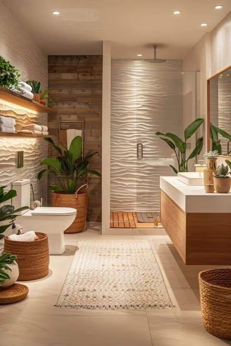
The layered system that actually works
Spa bathrooms use at least two separate lighting circuits. The first handles ambient light — a soft, overall glow from cove lighting, a pendant, or carefully placed ceiling fittings. The second handles task lighting, typically at mirror height for grooming. Both should be on dimmers, and both should use warm-white bulbs in the 2700K range. That colour temperature is warm enough to feel relaxed without being so dim it’s impractical.
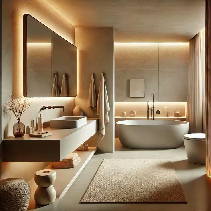
The layer most people miss is low-level accent lighting — something beneath the vanity, inside a niche, or at skirting level that washes the floor with light from below. It sounds subtle. The effect is transformative. That low angle creates depth and warmth that no ceiling fixture can replicate.
Minimise spotlights. They push light downward in the harshest, most direct way possible. Used sparingly they’re fine; relied upon exclusively, they make every bathroom look like a changing room.
For a deeper breakdown of placement and IP ratings, the best lighting for bathrooms guide covers the practical side in full.
IP ratings, simply explained
Any fitting within 60cm of a bath or shower needs to meet IP44 rating minimum — which means it’s protected against water splashes. Directly inside a shower zone, you need IP65 or above. Your electrician will verify this; the key thing is not to fall in love with a fitting before checking it’s suitable for where you want to put it.
The Case for Fewer, Better Materials
Spa bathrooms don’t use many different materials. That restraint is one of the things that makes them feel calm — and it’s one of the things most DIY renovations get wrong.
When a bathroom has different tile on the floor, different tile in the shower, painted walls in two colours, chrome fittings, white sanitaryware, and a wood vanity with a stone top, it’s asking the eye to process a lot of competing information. The visual noise is exhausting, even if you can’t identify why.
The alternative — two or three materials, used consistently — creates what designers call continuity. The same stone on floor and walls. The same warm plaster tone throughout. The same hardware finish on every fitting. The room becomes coherent rather than assembled.
Natural stone: beautiful, but understand what you’re committing to
Natural stone — travertine, limestone, marble — is genuinely hard to replicate. It develops character over time, catching light differently as it ages, warming slightly with use. That’s the appeal. The trade-off is real: natural stone is porous and needs sealing regularly, typically once or twice a year depending on use. Unsealed, it absorbs moisture, products, and staining.
If sealing sounds like a maintenance commitment you won’t keep, large-format porcelain tiles that replicate natural stone are far more credible than they used to be. The best ones — particularly from brands like Mandarin Stone or similar suppliers — are difficult to distinguish from the real thing at anything other than close inspection. They need no sealing and clean easily. That’s not a compromise; it’s a practical choice.
Wood in wet environments
Wood in bathrooms polarises opinion. Used carefully, it adds warmth and organic contrast that no other material provides — aged oak on a vanity, fumed oak flooring, teak on a bath surround. The key is the word “carefully.” Wood in direct water contact, without proper treatment, will deteriorate. Wood-look porcelain tiles are a reliable alternative for floors. For vanity units and cabinetry, a properly sealed solid wood or a high-quality wood veneer will perform well away from direct water exposure.
Bronze and brass hardware — and why they read warmer than chrome
Chrome is perfectly functional hardware. It’s also cold, reflective, and slightly clinical in a way that undermines the warmth you’re trying to create everywhere else.
Brushed brass, unlacquered brass, and bronze all interact with light differently. They absorb some of it rather than reflecting it directly back. They complement warm stone tones rather than contrasting against them. And bronze in particular develops a patina over time — a slight deepening and softening — that makes it look more considered with age rather than less. That’s the opposite of chrome, which shows every water spot.
Keep hardware consistent across every fitting in the room. Mixed finishes in a spa bathroom don’t read as eclectic — they read as unconsidered.
Wet Rooms and Freestanding Baths: When They’re Actually Worth It
These are the two fixture choices most associated with spa bathroom design, and they’re genuinely transformative when the space and budget support them. They’re also sometimes done because they look good in photographs rather than because they improve daily use.
A wet room — a fully waterproofed open shower area without an enclosure — works best when the bathroom is large enough to maintain a true separation between wet and dry zones. In a compact bathroom, an open wet room can make the entire space feel damp. A well-chosen glass screen or a properly enclosed shower enclosure will serve a small bathroom better than a wet room that compromises the rest of the space.
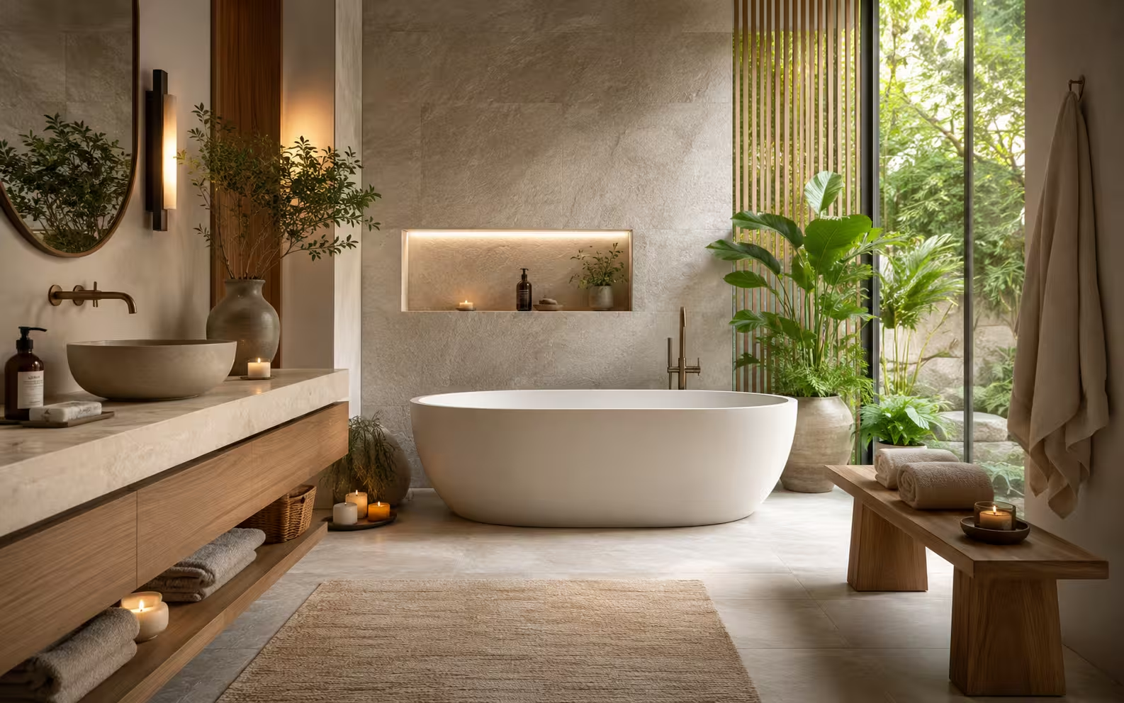
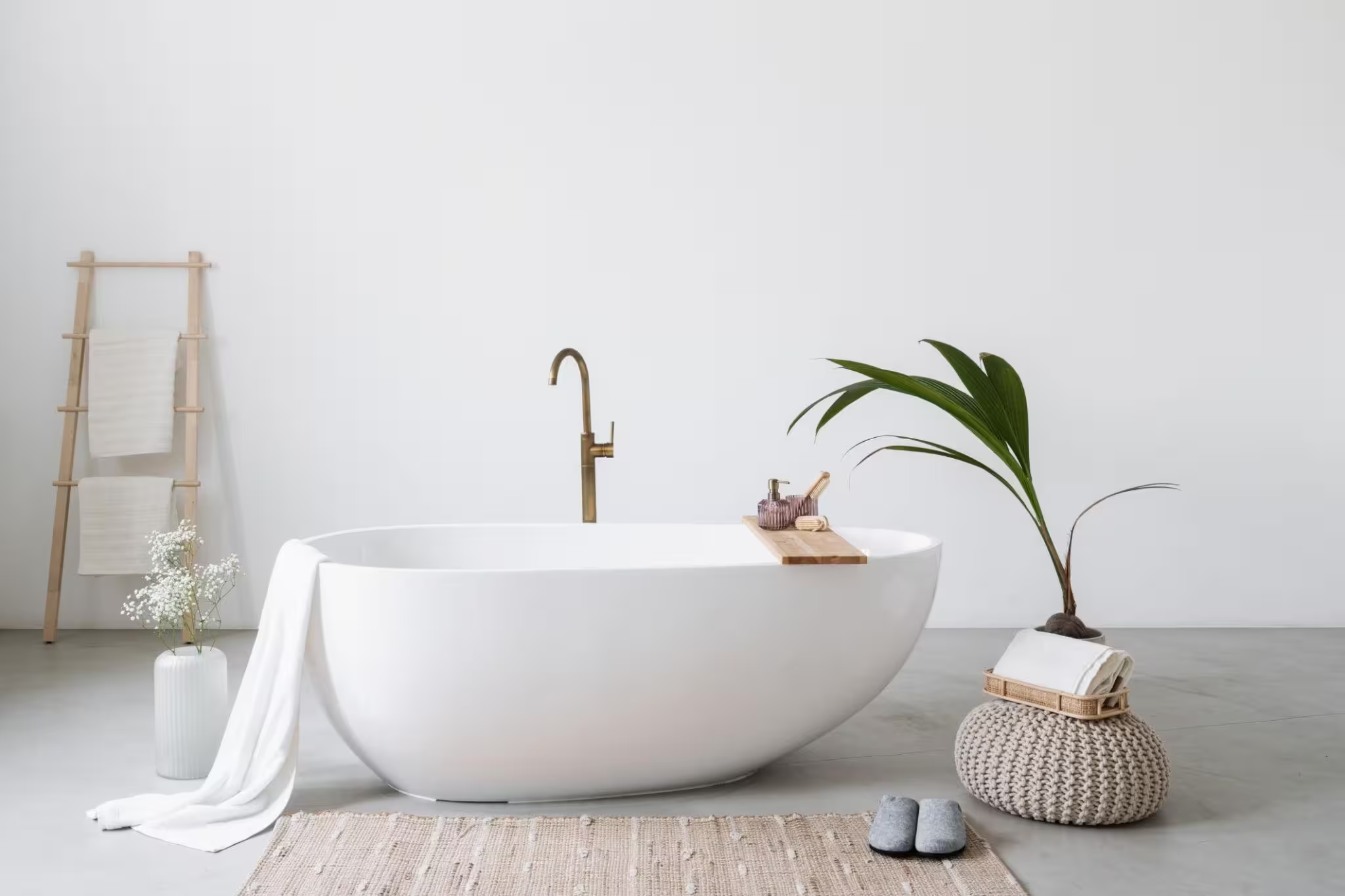
A freestanding bath is a genuine focal point. It reads sculptural, it creates a sense of occasion around bathing, and it works across a wide range of design styles — from contemporary to country house. The practical caveat: freestanding baths require plumbing that reaches the centre or end of the bath rather than a wall, which has cost and layout implications. In a tight bathroom, a built-in bath with beautifully panelled surround can achieve a similar sense of quality at a fraction of the complexity.
For a full overview of layout ideas, modern bathroom decor ideas covers the configuration thinking in detail.
Colour and the Logic Behind Calm
Colour shapes how a bathroom feels emotionally before you’ve consciously registered it. The choices that work in spa design are consistent across virtually every example: warm, natural, and quiet.
Neutrals that feel warm, not cold
The distinction that matters most is not light versus dark — it’s warm versus cool. A pale warm grey reads like stone. A pale cool grey reads like a hospital corridor. Soft white with yellow or pink undertones reads like linen. Soft white with blue undertones reads like a dentist’s waiting room.
For reliable warmth, look at paints in the cream, warm stone, and soft clay families. Muted sage and earthy green work well and connect the space visually to natural materials. The brands that consistently get this right — Farrow & Ball, Little Greene, Edward Bulmer — have palettes where the warm and cool undertones are visible on the tin; always test on the actual wall before committing.
Muted blues and greens: the spa colour logic
There’s a reason almost every actual spa uses muted blue-green tones somewhere in the palette. They evoke water, moss, vegetation — sensory associations with stillness and nature that work semi-consciously. Muted teal on a feature wall, sage green panelling, or deep olive on a bath surround all tap into this. They’re not neutral, but they’re calm. Explore more on best paint colours for bathroom spaces if you’re still deciding.
When to use a bold accent
Small, contained spaces can carry a bolder colour decision better than large ones. A deep charcoal or a rich terracotta in a small ensuite reads jewel-like rather than overwhelming. The logic is that the walls are close — the colour surrounds you rather than dominating a large surface — and in that proximity it becomes immersive rather than heavy.
Visual Quiet: What Concealed Storage Actually Does
Clutter is the enemy of calm. Not because it’s aesthetically imperfect, but because visible clutter — bottles on a shelf, a crowded towel rail, products lined up along a bath edge — demands low-level cognitive processing. The eye scans it. The brain registers it. The room can’t settle.
Concealed storage solves this. Not hidden for the sake of tidiness, but hidden to remove visual demand from the space. Mirrored cabinets that look like mirrors. Vanity drawers that close flush. Recessed niches in shower walls that hold products without projecting into the space. The practical essentials are still there; they just don’t announce themselves.
Floating vanities are worth the investment here. Raising the vanity off the floor extends the visible floor plane, making the room read as larger and airier. That’s a spatial perception trick, not just a style choice.
For ideas on how to style what’s visible, bathroom shelf styling is a useful resource for the balance between display and restraint.
The Finishing Layer: Texture, Linens, and Greenery
Once the structural decisions are made — lighting, materials, colour, storage — this is where the sensory quality gets refined.
Texture matters because hard, flat surfaces create a particular kind of acoustic and visual harshness. A woven bath mat, a linen blind, a cotton shower curtain — these absorb sound slightly and soften the light that hits them. The room becomes quieter, in the truest sense. It’s not about decoration. It’s about surface quality.
Towels deserve more consideration than they usually get. A truly plush towel — heavy, tightly woven, large enough to wrap around properly — feels different against skin in a way that genuinely contributes to the ritual of bathing. It’s one of the lowest-effort, highest-impact changes you can make. Luxury bathroom accessories covers the full range of finishing-layer choices worth considering.
Plants work in bathrooms — but selectively. Ferns and peace lilies genuinely thrive in humid, lower-light conditions. Orchids do well in indirect light with occasional misting. The mistake is choosing plants for aesthetics and putting them where they’ll struggle: cacti in a steamy bathroom, or large tropical plants in a poorly ventilated space. If humidity is inconsistent, a few well-chosen dried botanicals or a single eucalyptus bundle hung near the shower achieves the visual connection to nature without the maintenance concern.
Spa Bathroom Ideas for Smaller Spaces
The honest answer is: yes, a small bathroom can feel like a spa. But it requires different thinking, not just the same thinking applied to a smaller space.
The first adjustment is material continuity. In a small bathroom, using the same tile on floor and lower walls — rather than switching materials — makes the space read as unified and intentional rather than divided and cramped. Vertical tile lines add apparent height. Horizontal lines add apparent width.
The second is light strategy. A small bathroom with poor lighting feels like a cupboard. The same bathroom with warm ambient lighting, a well-placed mirror, and a few low-level accent fittings feels like a considered space. The mirror placement matters enormously — positioned opposite the main light source, it doubles the perceived brightness without adding any actual light.
A floating vanity in a small bathroom gives back floor space that a pedestal basin never allows. That recovered floor plane changes how the room feels to stand in, even if the square footage is identical.
For a full breakdown of layout and fixture choices for compact rooms, small bathroom decor hacks covers the specific constraints in detail.
What to Do If You’re Not Ready for a Full Renovation
The most underserved audience in bathroom design content is the person who wants their bathroom to feel better but can’t — or won’t — undertake structural work. This section is for them.
Start with the lighting. Swap cool-white bulbs for warm-white (2700K) equivalents. Add a dimmable smart bulb or a plug-in wall light near the mirror. These changes cost very little and make an immediate, noticeable difference to how the room feels in the evening.
Then the mirror. A good mirror — with a warm-toned frame, or a simply designed rimless piece with some weight to it — reads completely differently from a standard bathroom mirror. It’s furniture, not just a functional surface. Best mirrors for bathroom styling is worth reading before you buy.
Add a fabric element. A proper blind instead of frosted glass, a linen shower curtain, a large bath mat with real texture — any of these soften the acoustic quality of the room and introduce warmth that hard surfaces can’t provide.
Finally: remove things. Clear the bath edge, pare back the products on display, edit the towel rail. Visual quiet is often about subtraction rather than addition. A bathroom with fewer things visible reads as more considered and more calming, even if nothing has been renovated.
For a full list of no-structural-work changes with real impact, budget bathroom decor makeover ideas goes deep on exactly this.
FAQs
The combination of warm layered lighting, a limited and cohesive material palette, concealed storage, and at least one tactile luxury element — whether that’s a heated floor, a freestanding bath, or properly weighted towels. It’s less about specific products and more about how these elements work together to reduce visual noise and engage the senses calmly.
Soft warm neutrals — pale stone, warm white, muted clay — form the most reliable base. Muted blues and greens add a natural, water-adjacent quality that reinforces calm. Avoid cool white or stark grey, which tend to read clinical rather than restful. Matte and eggshell finishes read softer than gloss under most lighting conditions.
No. A small bathroom can feel genuinely spa-like with the right lighting strategy, consistent materials, a floating vanity to open the floor plane, and careful editing of what’s visible. The key is cohesion, not square footage.
A layered system: warm-white ambient lighting on a dimmer for overall mood, task lighting at mirror height for grooming, and accent lighting beneath the vanity or inside wall niches for depth. All fittings should use 2700K warm-white bulbs. Minimise ceiling spotlights — they create harsh, flat light that works against the calm you’re building.
Brushed brass, unlacquered brass, or bronze. These finishes absorb light rather than reflecting it harshly, complement warm stone and wood tones, and develop character over time. Keep the same finish across every fitting in the room — consistency is what creates that considered, unified quality.
Relying on cool-white lighting. Using too many competing materials. Keeping storage visible. Choosing chrome when the rest of the palette is warm. And adding decorative touches — candles, trays, plants — without first addressing the structural decisions around light and surface quality. For a full rundown, bathroom decor mistakes homeowners make covers the most common ones in detail.